
Our Brand and Logo Journey
An organisation is known by its ‘brand’. How professional, how interesting, how traditional or contemporary it might be are all perceived through a raft of ideas and images. These include its name, logo, slogan, design, people and overall customer experience.
On 16 October 1861 Bank of New Zealand opened for trading. The name was the brand and it represented trust, reliability, ownership and security.
In 1954 Bank of New Zealand was granted its own Coat of Arms. The stars on the blue background of the shield represent the constellation of the Southern Cross and the gold bezants represent wealth and prosperity.
The kiwi, which is incorporated into the crest, is described in the original 1954 granting document as ‘Standing on a Mount of Earth with Ferns proper growing there on a kiwi.’
In 1969 the Coat of Arms evolved into the logo known as ‘the Chevron’. This logo represented the Bank for nearly 40 years.
The logo features:
- The square – a perfect and regular geometric form representing solidarity and exactitude.
- Stars – the constellation of the Southern Cross
- Two Chevrons – gold, rafter-like lines meeting at a peak for support, reliability and strength
- Bezants – five Byzantine gold coins of 9th century Europe representing money.
For nearly 150 years the Bank anticipated and responded to changes in our New Zealand lifestyle. In 2008, Bank of New Zealand abbreviated its name to BNZ and developed a new logo to better reflect the modern, innovative and customer-focused organisation it had become.
In 2010 the Southern Cross was brought back to the BNZ logo. These stars connect the bank with its past and are a symbol of BNZ’s commitment to New Zealand.

The name as the brand - 1908
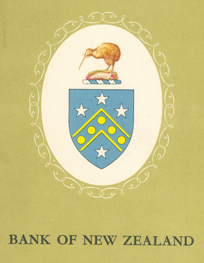
Coat of Arms and Crest - 1954
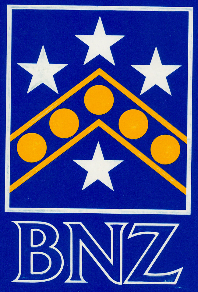
The Chevron - 1981
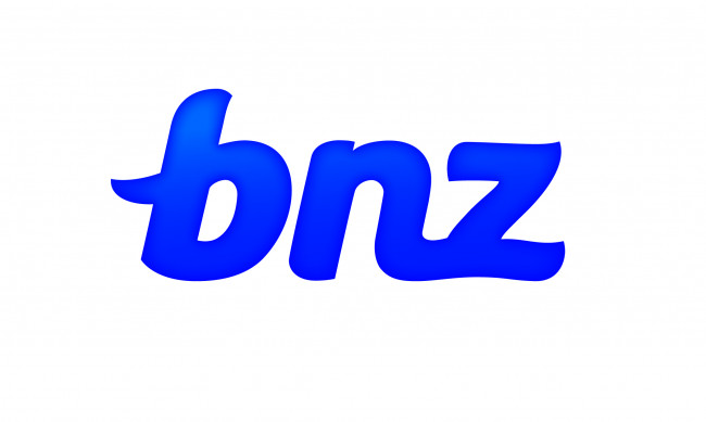
A smaller name with a big heritage - 2008
Welcoming back the Southern Cross - 2010


